

Your personal brand says something before you ever open your mouth. Colors do most of the talking. Choosing the right color palette for a personal brand is not about picking what looks pretty on Pinterest, it is about choosing a visual language that reflects who you are, attracts the right people, and stays consistent whether someone finds you on LinkedIn, your website, or a printed business card.
This guide walks designers and solopreneurs through a 7-step process to build a palette rooted in strategy, not just aesthetics.
Why Your Color Palette Matters More Than You Think
Color influences perception in milliseconds. Studies on snap judgments show that people form an opinion about a brand within 90 seconds, and up to 90% of that judgment is based on color alone. For a personal brand, where you are the product, this is even more critical.
A strong palette helps you:
- Build instant recognition across platforms
- Communicate personality without words
- Attract clients or followers who align with your values
- Save hours of decision fatigue when creating content

The 7-Step Process to Build a Color Palette for Your Personal Brand
Step 1: Define Your Brand Personality in 3 Words
Before opening any color tool, write down three adjectives that describe how you want your audience to perceive you. Examples:
- Bold, modern, direct for a business coach
- Calm, trustworthy, refined for a financial advisor
- Playful, creative, warm for an illustrator
These words become your filter. Every color you consider later must support at least one of them.
Step 2: Understand the Psychology Behind Each Color
Colors carry meaning. Here is a quick reference to help you match emotion with intention:
| Color | Common Associations | Best For |
|---|---|---|
| Blue | Trust, calm, intelligence | Consultants, tech, finance |
| Red | Energy, urgency, passion | Coaches, fitness, entertainment |
| Yellow | Optimism, warmth, attention | Creators, educators |
| Green | Growth, health, balance | Wellness, sustainability, finance |
| Purple | Creativity, luxury, wisdom | Designers, premium services |
| Black | Sophistication, authority | Luxury, fashion, agencies |
| Pink | Empathy, playfulness, modernity | Lifestyle, beauty, community brands |
Step 3: Choose Your Primary Color
Your primary color is the one people will most associate with you. It will dominate your website hero, profile graphics, and major touchpoints. Pick one color that aligns with your personality words and feels true to you. If you cannot wear it or live with it for two years straight, choose another.
Step 4: Add One or Two Secondary Colors
Secondary colors support the primary. They give variety without stealing the show. A reliable formula:
- Primary color (60% of usage)
- Secondary color (30% of usage)
- Accent color (10% of usage)
For harmony, pick secondaries using one of these methods:
- Analogous (colors next to your primary on the color wheel) for a calm, unified look
- Complementary (opposite on the wheel) for high contrast and energy
- Monochromatic (different shades of the same hue) for sophistication
Step 5: Pick a Bold Accent Color
The accent is your attention grabber. Use it for call-to-action buttons, highlights, and the moments where you want eyes to lock in. It should contrast with your primary, but still respect your personality words. A muted brand should not suddenly drop a neon orange unless that tension is intentional.
Step 6: Add Neutrals for Balance
Neutrals are the unsung heroes of every palette. They create breathing room and improve readability. Choose:
- A dark neutral for body text (charcoal often works better than pure black)
- A light neutral for backgrounds (off-white or warm cream is easier on the eyes than pure white)
- Optional: a mid-tone neutral for borders, dividers, and subtle UI elements
Step 7: Test Across Real Platforms Before You Commit
This is the step most people skip and later regret. Before finalizing, mock up your palette on:
- An Instagram or LinkedIn post
- Your website hero section
- A presentation slide
- A printed business card or PDF lead magnet
- Light mode and dark mode displays
Check accessibility too. Use a contrast checker like WebAIM to confirm your text remains readable. A color palette that fails accessibility fails your audience.
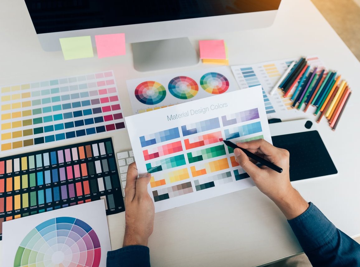
Tools to Help You Build and Test Your Palette
- Coolors.co for fast palette generation and locking favorites
- Adobe Color for exploring color theory rules visually
- Khroma which uses AI trained on your color preferences
- Realtime Colors for testing your palette on a live website layout
- WebAIM Contrast Checker for accessibility validation

Common Mistakes to Avoid
- Copying a brand you admire. Their palette serves their audience, not yours.
- Choosing too many colors. Stick to 4 to 6 total including neutrals.
- Ignoring your photos. If you post selfies or product shots, your palette must work with your skin tone, lighting, and visual style.
- Forgetting documentation. Save your HEX, RGB, and CMYK codes in a brand sheet. Future you will be grateful.
- Changing it every six months. Recognition is built through repetition. Commit for at least 18 to 24 months.

Real Example: A Palette in Action
Imagine a freelance copywriter whose personality words are witty, sharp, human. A possible palette:
- Primary: Deep navy (#1B2A4E) for authority
- Secondary: Warm coral (#FF6B5B) for human warmth
- Accent: Mustard yellow (#F4B942) for wit and attention
- Neutrals: Charcoal (#2B2B2B) and cream (#FAF6F0)
This palette works because it ties every color back to the three personality words. Nothing is there by accident.
Frequently Asked Questions
How many colors should a personal brand palette have?
Four to six colors works best: one primary, one or two secondaries, one accent, and one or two neutrals. Fewer feels limiting, more becomes hard to manage consistently.
Can I use trending colors in my personal brand?
You can take inspiration from trends, but build your palette around timeless choices. Trends fade quickly and rebranding every year breaks recognition.
Should my personal brand colors match my industry?
Not necessarily. Matching your industry plays it safe. Standing out strategically often gets more attention, as long as your colors still align with your audience expectations.
How do I know if my colors work well together?
Apply the 60-30-10 rule, check contrast for accessibility, and mock up real designs before committing. If the palette still feels balanced after a week of use, it works.
Do I need to hire a designer to choose my palette?
Not always. With the tools and steps in this guide, most solopreneurs can build a strong palette on their own. A designer becomes valuable when you want a full visual identity system, including logos, typography, and brand guidelines.
Final Thoughts
Building a color palette for your personal brand is less about following design trends and more about translating who you are into a consistent visual signal. Follow the seven steps, test across platforms, and commit long enough for recognition to take root. Done right, your palette becomes one of the hardest-working assets in your brand toolkit.