
If you have ever stared at a logo and thought “something feels off” without knowing why, the answer is almost always spacing. And spacing in typography comes down to three controls: kerning, tracking and leading.
Most articles on kerning vs tracking stop at a one-line definition. This guide goes further: you get the definitions, visual comparisons you can reproduce in seconds, the exact numeric values professionals use in Adobe Illustrator, InDesign and Figma, and the spacing mistakes that quietly ruin logos and body copy.
The 15-second answer
| Control | What it adjusts | Direction | Applies to |
|---|---|---|---|
| Kerning | Space between two specific letters (a pair) | Horizontal | One insertion point between two glyphs |
| Tracking | Space between all letters uniformly | Horizontal | A word, a line, a paragraph, a whole style |
| Leading | Space between lines of text | Vertical | Paragraphs and text blocks |
In one sentence: kerning fixes a local problem between two letters, tracking sets the overall density of a run of text, and leading controls how the lines breathe vertically.
Kerning: fixing awkward letter pairs
Kerning is the adjustment of space between two individual characters. It exists because letterforms have different shapes, and mathematically equal spacing does not look optically equal.
Look at these classic problem pairs:
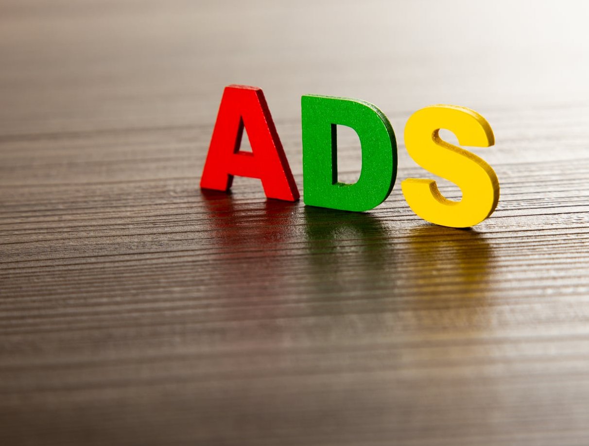
- A + V (as in AVATAR): two diagonals lean away from each other and open a gap.
- T + o (as in Tomorrow): the round letter can tuck under the T crossbar.
- L + A, W + a, P + ., r + y, f + “: all notorious.
- Any letter next to a quote, period or comma.
Side-by-side example you can test right now
Type the word WAVE in caps at 120 pt, then compare:
- No kerning applied (metrics off): the W and A create a visible hole, and the word reads as “W AVE”.
- Optical kerning applied: the diagonals nest closer, the four letters read as one shape.
- Over-kerned: letters collide, the V looks glued to the A, and legibility drops.
The mood changes too. Tight, perfectly kerned caps feel confident and premium. Loose, unkerned caps feel amateur, like a default template.
When should you kern manually?
- Always for logos, wordmarks, and large display headlines.
- Sometimes for subheads above roughly 24 pt.
- Almost never for body copy. At 10 to 16 pt, the font’s built-in kerning table already handles it, and manual pair tweaks would take hours for zero visible gain.
Tracking: setting the overall density and mood
Tracking (also called letter spacing on the web) adds or removes the same amount of space between every character in your selection. It does not solve pair problems, it changes texture.
How tracking changes mood
| Tracking | Visual effect | Feels like | Good for |
|---|---|---|---|
| Negative (tight) | Dense, dark text block | Urgent, bold, editorial | Large headlines, magazine covers |
| Zero (default) | As the type designer intended | Neutral, readable | Body copy, most UI text |
| Slightly positive | Airy, lighter grey value | Calm, refined, luxury | All caps, small labels, fashion branding |
| Heavily positive | Letters read individually | Slow, decorative, spaced-out | Short taglines only |
Key rule: the bigger the type, the tighter the tracking should be. The smaller the type, the more it benefits from a little extra space. Display sizes need negative tracking, captions and 9 pt legal text need positive tracking.
The all-caps rule
Capital letters were never designed to sit next to each other in long runs. Set any all-caps text with positive tracking. Without it, caps look cramped and hard to scan. This single habit instantly improves navigation menus, buttons, eyebrow labels and section titles.
Leading: the vertical spacing nobody tunes (but should)
Leading is the distance from one baseline to the next baseline. The name comes from the strips of lead that printers slid between lines of metal type.
Leading is the single biggest lever on readability of body copy, bigger than font choice for most projects.
Side-by-side example
Take a paragraph at 16 pt:
- 16 pt type / 16 pt leading (100%): lines touch, descenders clash with ascenders below, the eye loses its place mid-paragraph.
- 16 pt type / 24 pt leading (150%): comfortable, the eye returns to the correct line automatically.
- 16 pt type / 40 pt leading (250%): lines float apart, the paragraph stops reading as one unit and feels like a list.
Leading and line length work together
Long lines need more leading. If your measure is wider than about 90 characters, the eye has a longer return journey and needs a taller step to find the next line. Short columns can use tighter leading. The topic gets a thorough treatment elsewhere.
Practical settings for Illustrator, InDesign and Figma
Adobe Illustrator and InDesign
Both use the same unit for kerning and tracking: 1/1000 em. So a tracking value of 20 at 100 pt type adds 2 pt of space between each character.
Where to find them: the Character panel (Window > Type > Character), or press Ctrl/Cmd + T.
- Kerning field: place the cursor between two letters, then type a value or use
Alt/Option + Left/Right arrow. - Tracking field: select a range of text, a whole frame, or set it inside a Paragraph Style.
- Metrics vs Optical: “Metrics” uses the kerning pairs built into the font file. “Optical” lets Adobe recalculate spacing based on letter shapes. Use Optical for display type, mixed fonts, and fonts with poor built-in kerning. Use Metrics for well-made professional text fonts in body copy.
| Use case | Tracking (1/1000 em) | Leading |
|---|---|---|
| Body copy, 9 to 12 pt print | 0 to +10 | 120% to 140% of type size |
| Subheads, 18 to 30 pt | -5 to -15 | 110% to 120% |
| Display headlines, 48 pt + | -15 to -40 | 90% to 105% |
| All caps labels and buttons | +50 to +150 | 120% |
| Small print, captions, legal | +10 to +25 | 130% to 145% |
InDesign tip: turn on Type > Show Hidden Characters and switch the Info panel on while you kern, so you can see exactly which value you applied. Also avoid “Auto” leading (120% by default) in professional layouts. Set an absolute point value inside your Paragraph Style so the leading never jumps when someone drops a larger character into the line.
Figma
Figma speaks CSS, so the labels differ:
- Letter spacing = tracking. Enter it as a percentage, not pixels, so it scales with the font size across your design system.
- Line height = leading. Enter it as a percentage for text styles, or as a fixed pixel value when you need precise vertical rhythm in components.
- Kerning is controlled through the Type settings panel: keep the OpenType kerning feature enabled. Figma has no per-pair kerning field, so for a wordmark you must outline the text (or split characters into separate layers) and nudge glyphs manually.
| Figma text style | Letter spacing | Line height |
|---|---|---|
| Body 16 px | 0% to 0.5% | 150% |
| Small text 12 to 14 px | 0.5% to 1.5% | 140% to 150% |
| H2 to H3, 24 to 32 px | -0.5% to -1% | 120% to 130% |
| Hero H1, 48 px + | -1.5% to -3% | 100% to 110% |
| Buttons and caps labels | +5% to +10% | 100% to 120% |
Quick conversion between tools
Adobe tracking units are thousandths of an em. To convert to CSS or Figma percentage, divide by 10.
- Adobe tracking -20 = -2% letter spacing = -0.02em
- Adobe tracking +75 = +7.5% letter spacing = 0.075em
The most common spacing mistakes
In logos and wordmarks
- Tracking used to fix a kerning problem. One gap looks big, so the designer adds space everywhere. Now the whole wordmark is loose and the original hole is still visible. Fix the pair, not the run.
- Kerning by numbers instead of by eye. Spacing is optical. Flip the logo horizontally or blur your eyes: uneven gaps jump out immediately.
- Crushing letters together to look “modern”. Negative tracking on a bold geometric sans quickly turns “rn” into “m” and “cl” into “d”.
- Kerning only at one size. A wordmark kerned on a 2000 px canvas can collapse into mush as a 24 px favicon. Test small.
- Forgetting to lock it in. If the logo stays as live text, anyone can retype it and lose every kerning tweak. Outline the final artwork.
In body copy
- Leading too tight. The number one readability killer online. If your line height is below 140% for paragraph text, fix that before anything else.
- Negative tracking on small text. Tight tracking that flatters a 60 pt headline makes 11 pt text look muddy.
- Letting justified text create rivers. Justified columns that are too narrow stretch word spaces into white channels running down the page. Widen the measure, allow hyphenation, or set the text ragged right.
- Auto leading on mixed-size lines. One larger character in a paragraph and the whole line jumps. Use fixed leading values.
- Spacing out lowercase text for effect. Frederic Goudy’s warning still applies: heavy tracking on lowercase destroys the word shapes readers rely on to scan.
- Ignoring caps. All-caps text with zero tracking in a menu or button is one of the most common and most fixable errors on the web.
A simple workflow to get spacing right
- Choose the typeface and set the size first. Spacing decisions depend on both.
- Set leading next, because it defines the texture of the page more than anything else.
- Set tracking at the style level: one value per text style, saved in a Paragraph Style or Figma text style.
- Only then apply kerning, and only to display type and logos.
- Proof at final size, printed or on device, then squint. If a gap pulls your eye, it needs work.
FAQ
Is tracking the same as leading?
No. Tracking is horizontal spacing applied uniformly between characters. Leading is vertical spacing between baselines of consecutive lines. They are completely separate controls, though both affect how dense a text block appears. superside.com walks through the specifics.
What is tracking in typography?
Tracking is the uniform adjustment of space between all characters in a selected word, line or block of text. In Adobe apps it is measured in thousandths of an em, and in CSS or Figma it appears as letter spacing in em, percentage or pixels.
Is tracking the same as letter spacing?
Practically yes. “Tracking” is the print and Adobe term, “letter spacing” is the web and CSS term. They both add or remove the same amount of space between every character. The only difference is where the extra space is added: CSS adds it after each character, which is why the last letter of a line can appear to sit slightly off when using large positive values. This write-up is worth a look.
What are the basic rules of kerning?
- Kern by eye, not by numbers.
- Aim for equal optical area between letters, not equal measured distance.
- Work on the tightest pair first, then match the rest to it.
- Focus on diagonals (A, V, W, Y), rounds (O, C, o, e) and letters with overhangs (T, F, P, r).
- Look at three letters at a time, never two in isolation.
- Never kern body copy manually. Trust the font.
Does kerning affect SEO or page speed?
Not directly, but letter spacing and line height affect readability, which affects how long visitors stay on a page and whether they finish reading. Google’s guidance on page experience also flags text that is hard to read on mobile, so generous leading and sensible tracking are worth the few minutes they take.
Which one should a beginner learn first?
Leading. It has the biggest impact on readability, it is easy to get right with a simple percentage rule, and it applies to every project. Tracking comes second, kerning last.
Key takeaways
- Kerning = two letters. Local repair, display type only.
- Tracking = all letters. Global density and mood, set it in your styles.
- Leading = between lines. Your main readability control.
- Bigger type wants tighter spacing. Smaller type wants looser spacing.
- All caps always need positive tracking.
- Body copy rarely needs anything below 140% line height.
Get those three controls under conscious control and your work will immediately look more deliberate, even before you change a single font.